Posters enjoy a clear advantage when it comes to capturing the attention of viewers, thanks to their imposing size. Traditionally composed of a blend of graphic images, text, and vibrant, contrasting colours, posters have served as a promotional medium for centuries. They’ve been utilised to disseminate propaganda, organize demonstrations, and, more recently to advertise films, concerts, and large public gatherings.
In contrast to other forms of printed promotional advertising, such as leaflets or booklets, posters aim to make a bold statement to their audience from a distance. However, in settings like doctor’s offices, waiting rooms, and hotels, a more informative approach can be adopted. This allows for the conveyance of detailed information in an educational manner rather than relying on shock tactics.
Outlined below are some key elements to consider when designing your poster:

Carefully select your background colour to avoid overpowering your design. In most cases, posters feature crucial information at the forefront, with the background serving either to break up empty space or to complement the text in the foreground, enhancing its visibility rather than detracting from it.

Exercise caution when applying colour to your design. While everyone aims for an attention-grabbing poster, it’s important to use colour judiciously. Occasionally, a contrast between two colours can be remarkably effective; classic black and white, for instance, can be very effective. In contrast, an excess of colour can lead to a cluttered and overwhelming design. Here, the adage “less is more” certainly holds true.
A common issue we often face with customers involves the incorrect use of image resolution in their brochures. In the realm of printing, high-quality images and graphics are crucial, as even a single low-quality image can adversely affect the entire booklet. For optimal print quality, 300 DPI (dots per inch) stands as the gold standard, ensuring sharp and clear images. Using low DPI bitmap images can lead to pixelation and a visually unattractive, blocky appearance. If your brand prides itself on offering premium products and services, subpar images have the potential to damage your reputation.
We strongly recommend verifying the DPI of every image in your brochure before finalizing and submitting your files for print. Maintaining this essential aspect of image quality can significantly enhance the overall appeal and professionalism of your printed materials.

Maintain conciseness and directness in your design. The information you include should consist of the most essential headlines of your message, with no room for intricate details. One of the most iconic posters ever created, dating back to 1914 for wartime efforts, is Lord Kitchener’s “Your country needs you.” This poster’s effectiveness lies in its simplicity and engagement. It delivers a powerful message through a striking illustration that features strong eye contact to instantly capture attention.

Ensure that the flow of your poster design is intuitive to follow. By “flow,” we refer to a hierarchy where the main heading text is read first, followed by any subheadings and any calls to action if necessary. Your audience typically lacks the time to decipher what information is primary versus secondary. Therefore, it’s crucial to establish a noticeable contrast between the primary message and any supplementary details, making it clear which information takes precedence.
Recognise that your audience has only a few fleeting seconds to absorb the information presented on a poster. They could be walking past it or driving by, so it’s imperative to gauge the readability. A poster on a bustling main road, for instance, must be so succinct that it can be grasped in less than 2 seconds. On the other hand, a poster in a bus stop or hospital waiting room can afford to contain more details, as people there typically have more time to spare and are often willing to read to pass the time.
If you intend for your poster to catch the attention of people on the move, it’s advisable to conduct readability tests with your colleagues or friends. Ensure that they can grasp the primary message within the briefest glance, perhaps just one second, and then assess whether they capture the secondary message in a two-second glance. Depending on the results, you may need to adjust your design to optimize its effectiveness.
Using images and graphics at the correct resolution is paramount. Expecting a small A7 flyer to upscale to an A0 size without blurriness is unrealistic. However, there is some flexibility with posters. They don’t need to be produced at the same high resolution of 300dpi required for brochures or handheld leaflets. This discrepancy is due to the typical viewing distance for posters, which is greater than that for most reading materials. For materials you read at arm’s length, 300 dpi is the recommended minimum quality. But with posters, you stand a few feet away, allowing for a reduction in resolution to 150dpi when designing A2 or larger posters while still maintaining quality.
The resolution at which you should produce your poster depends on its size and viewing distance. Here are some general guidelines:
Remember that the final print quality also depends on the quality of the printer and the paper used. It’s a good practice to check with your printer for their specific requirements and recommendations regarding resolution and file formats to ensure the best results.
To achieve the greatest impact, prioritize easy-to-read fonts. Intricate script fonts are not suitable for headline-grabbing text, as they can be quickly overlooked, leading to a loss of the message’s impact. Additionally, excessive mixing of font styles should be avoided. It’s best to stick with complementary font styles. Consistency within the same font family tends to work well, but the occasional use of a completely different font can add visual interest and break up the monotony.

Capture attention with a memorable headline, drawing inspiration from the techniques employed by tabloid newspapers. Use a very large type, consisting of no more than six words, for your headline. Then, if necessary, include a secondary message that provides additional context or entices those who are intrigued by the headline. This approach ensures that you quickly engage your audience and encourage them to delve further into your poster’s message.

After your reader has grasped the message, it’s crucial to provide clear direction on what you want them to do next. Offer guidance on how they can contact you or obtain further information with the intention of potentially purchasing your products or services. Include the relevant contact details, whether you want them to call, visit your website, or reach out through social media.
However, it’s vital to strike a balance and avoid overwhelming your design. Too many points of contact can clutter your message and potentially confuse the reader. Aim to include one or two, and if absolutely necessary, up to three points of contact, but refrain from exceeding this limit. Keeping it concise ensures that your call to action remains clear and effective.

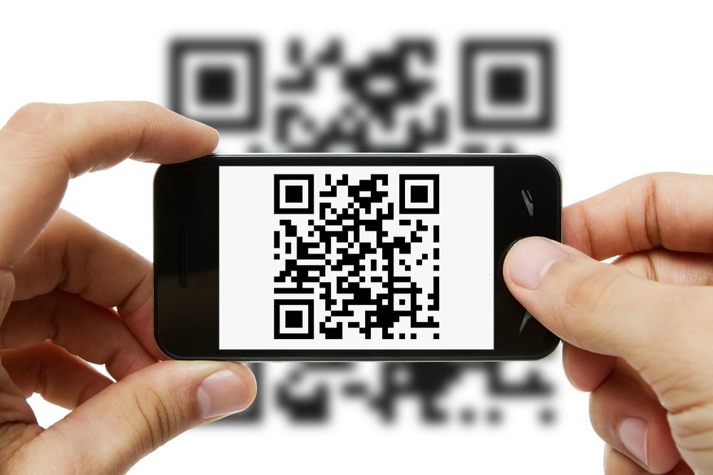
Poster printing offers an excellent opportunity for utilizing QR codes effectively. Readers can swiftly scan the barcode with their smartphones, allowing them to express their interest without immediate contact, which is often the case when they’re passing by the poster. This QR code integration is particularly valuable in the digital age.
With digital poster printing, you can even engage in A-B testing to evaluate the poster’s success with different QR codes. Here’s how it works: Design two posters, each with slightly different headlines or messages, and assign a unique QR code to each. By doing this, you can track the effectiveness through a landing page on your website. If one message proves more successful than the other, you can adjust the design accordingly to further enhance your poster’s impact. It’s a powerful way to fine-tune your messaging and design for optimal results.
Unlock 5%! Subscribe & Save
Copyright © Cheap as Prints 2025
We use cookies to enhance your experience. By continuing, you agree to our Privacy Policy.
Select which cookies you want to allow:
Save 5% on your order when you subsribe to our newsletter.